VIsualizing firewall activity
Inspired by the efforts of a previous Redpill Linpro colleague, Espen Grøndahl, I’ve revived (or rather re-invented) his project “Fireplot”. By analyzing and filtering firewall logs, Fireplot graphs attempts to access blocked firewall ports, visualizing unexpected and unwanted activity towards my network.
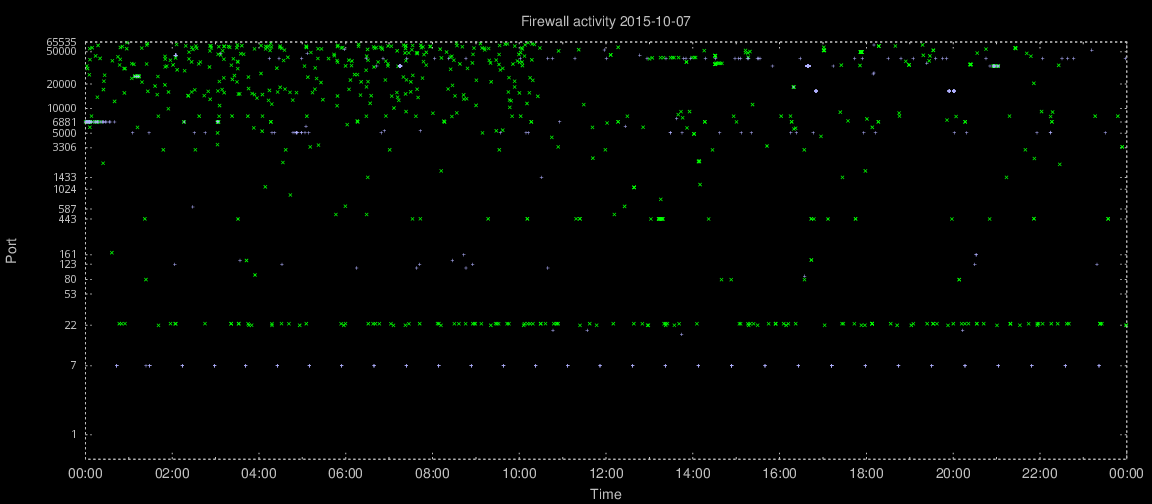
Firewall activity visualization – click image for original size
The Y axis is logarithmic, since activity towards lower ports is often more interesting. Over 24 hours, one graph per day, TCP activity is plotted in green and UDP activity in light blue. Note the horizontal line showing SSH (TCP port 22) and telnet (TCP port 23) probes. The graph also shows a very regular probing for UDP port 7.
I’m currently parsing logs from a Mikrotik firewall/router, but since the data gathering is merely a matter of an appropriate regular expression it shouldn’t be difficult to make it graph iptables logs or other firewall-ish log data.
The Perl code is very much in beta state at the moment, so I won’t publish any code just yet. Stay tuned for updates. Meanwhile, visit Lars Strand’s inspiring article on the original project!