The inherent risks of visualizing firewall probes
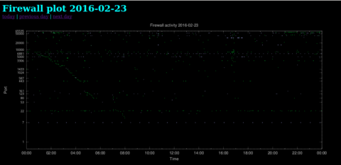
For some time now, I’ve been graphing all unsolicited network traffic destined for my network. For instance, it’s quite useful for detecting slow scans, which will show up as the diagonally aligned green scatter points in this plot (click to enlarge).
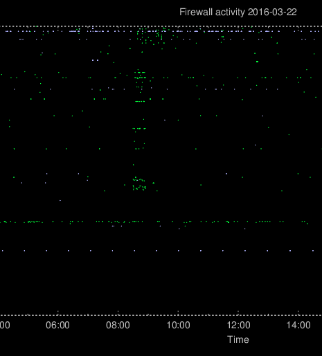
Other scans and probes often happen faster, when the attacker isn’t much concerned about being detected. These will appear in the plot as a lot of vertically aligned scatter points. In the plot shown below, the attackers have scanned a limited set of ports for about 30 minutes.
After writing a previous blog article about the plots as well as discussing the setup with my colleagues, and even showing what can happen with such a feature, there was really no reason to act surprised when weird patterns started to appear in the firewall plots.
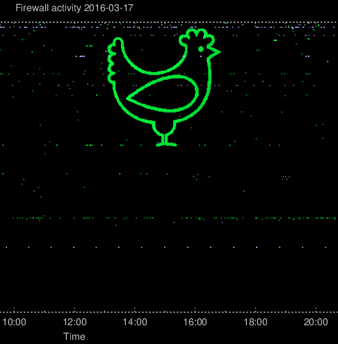
The first synchronized portscan resulted in a chicken. Because of the logarithmic scale of the plot, the attacksdrawings will have higher precision when aiming for the high ports.
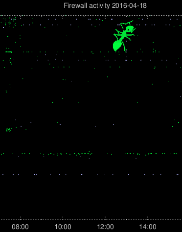
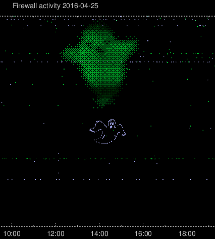
Then after a few weeks of just the normal hostile activity and a few not-so-successful creative port scans, a very well defined ant suddenly appeared.
In the firewall plot, TCP connections will be plotted as green and UDP connections will be plotted as light blue. After a few poorly disguised questions regarding whether I was plotting other protocols and, if so, which colors they would be, it became evident that some new plan was being hatched. And, lo and behold:
I’m already considering implementing additional colour schemes to separate IPv4 from IPv6, and I can probably just throw in the towel and ask my colleagues which colours they will need for their next piece of firewall art 🙂
